Author Archives: Mark Reyes

About Mark Reyes

Web Developer based out of Southern California.

Review of Digital Minimalism

Introduction

Digital Minimalism by Cal Newport is an important book that I’ve picked up in the last decade. It’s a pretty bold statement to make but for me personally, I was in the market for something which could help me out with some mental stress that I’d been carrying over my head. At the core of it all, the root cause is my iPhone. It’s been a great tool to have but it’s also come at a cost. And those tiny apps which sit inside of that expensive piece of machinery has caused me a ton of mental headaches, social anxiety and has misled me many times over with misinformation and half baked conversations.

Frankly, if I could summarize it, I felt sad. So I turned to this book in hopes of finding clarity in this gruesome situation and I wanted to share some of the things I thought were worth mentioning.

Summary

In short, Cal breaks down this form of anxiety from the very beginning. You should know this by now. 2004 and The Facebook takes hold. Then it’s 2007, roughly a year out from the Great Recession and Steve Jobs designs what Apple deemed to be the best iPod yet. Harnessing both the telephone and music player capabilities into one device, the iPhone was never originally presented as segue into mobile apps or the app store as one would assume. 

Through a series of short chapters, a total of 7, he takes you on this well explained journey: “A Lopsided Arms Race”, “Digital Minimalism”, “The Digital Declutter”, “Spend Time Alone”, “Don’t Click ‘Like'”, “Reclaim Leisure”, and “Join the Attention Resistance”.

What’s Important

Cal defines the meaning of Digital Minimalism quickly as,


“A philosophy of technology use in which you focus your online time on a small number of carefully selected and optimized activities that strongly support things you value, and then happily miss out on everything else.”

Addiction – not only relates to alcohol and drugs but is thoroughly explained in relation to our digital consumption too. Two forces in particular are explained: intermittent positive reinforcement and the drive for social approval. It’s a pretty nasty explanation on how the Like button impacts us.

“A Lopsided Arms Race” is worth reading over and over.

Digital Declutter – in summary this is essentially a proposal of blunt force trauma to your current digital usage. It’s a cold turkey technique of 30 days where he emphasizes that “aggressive action is needed to fundamentally transform your relationship with technology.”

To me, every process and thought explained in this book are equally important but “Join the Attention Resistance” has to be what Trevor Hoffman was to the San Diego Padres. It’s the closer and the final chapter in giving actionable advice to address this problem.

  • Practice: Delete Social Media From Your Phone
  • Practice: Turn Your Devices Into Single-Purpose Computers
  • Practice: Use Social Media Like a Professional
  • Practice: Embrace Slow Media
  • Practice: Dumb Down Your SmartPhone

Conclusion

For me, what didn’t work was digital declutter, so I compromised. I tried a cold turkey schedule every fourth week of the month. That worked once and my remaining attempts failed. So I tinkered and ended up using small wins which for me just add up. I removed Facebook and Twitter for good from my phone. I need a laptop when I dip into those worlds. 

All notifications for social media are turned off. And it’s really changed the way I frame other apps when I see them come to market. Long story short, I’m not on Tik Tok. It’s one of those scenarios where I continue to say to myself that if I never had it in the first place, I never really missed it.

I don’t look down on my past usage but I am moderately more assertive of what I’m doing when I’m inside of that Instagram game, a Messenger Chat or scrolling through a feed. And for now that’s step one which was definitely better than yesterday, when there were no steps at all.


This post may contain affiliate links. Should you make a purchase by clicking on any of the links, I may earn a commission at no extra cost to you. Read my full affiliate disclosure here.
Angular 9 Task App with NgRx & Drag Drop

TLDR – A todo/task list built with Angular 9. This app utilizes Angular Material’s drag and drop out of box and with the help of NgRx, the UI can maintain its previous state on page refresh.


Features

  • Provide sorting by table columns and searching.
  • Add sorting by multiple columns and persist the sorting on refresh.
  • Add the ability to drag and drop columns to reorder them using the native Angular cdk drag and drop.
  • Add ability to manually resize the columns by dragging with the mouse.
  • Use Angular, RxJs and NgRx for state management.

Demo

Conclusions

Easy

Filtering a list of tasks leveraging a search bar was straightforward enough, thankfully. Check out the pipe and how that ties back into the ngModel on the input element for further details. My implementation is for the most part 1:1 from this Stackblitz demo.

Medium

Imagine an excel spreadsheet in which you can resize the cells (see the purple drag handles on the To Do column). It’s a similar ask here.

At the time of this writing, Angular Material does not fully support a way to resize elements. It was asked in 2019 but I didn’t find anything from the current documentation. I found this ngx-cdk-drag-resize demo to be a good starting path leveraging Angular’s ElementRef API out of box.

The other gotcha was sorting by order. AngularJS did it but Angular’s core argument for not including that feature in their current API is simply for performance. Your options are limited to creating your own custom pipe or having your component take on that responsibility. In my case, the dynamicSort() function on my home page component is what I used to sort order attributes in ascending order.

Hard

Saving the order of drag and drop. Saving the order on drag and drop and distinguishing between to do and done. Saving the order on drag and drop, distinguishing between to do and done, refresh the page and ensuring the previous state was maintained.

That. Was. Hard.

My initial thought was to save via localStorage but having localStorage fly on its own was brittle and often caused inconsistencies when ad hoc testing. I needed a strict approach that could thoughtfully manage the user interaction, namely @ngrx/store because at its core everything is immutable. Acknowledging that very rule was hard to embrace but in my opinion it’s the way to go when creating insanely stable Angular web apps.

In my case, I used a combination of reducers, actions and effects.

It took me the better of two weeks just to understand NgRx on an elementary level so here’s my tip on how to get through these dense concepts. My suggestion assumes you’ve used Angular on a consistent basis and you’re looking to add on top of your existing knowledge of that.

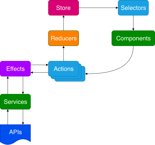
If you use Angular regularly then you’re familiar with the green action below called Components. You might even be communicating with a backend system which means the other green action, Services and that blue document, APIs are also part of your web app flow. An abundance of Angular tutorials are demonstrated with just these ingredients alone. So if you’re looking to spice it up with NgRx, add the following steps below.

Step 1

Review these additional actions and employ them where needed: Store, Selectors, Reducers, Actions and Effects.

Step 2

Follow the arrows. At all times, follow the arrows.

SOURCE: Adding NgRx to Your Existing Applications

Please feel free to fork this into your own creation.

And remember, when all else fails…StackOverflow. 😉

Aloha. 🤙🏾

Additional Resources

Not Everyone Has an iPhone

I’d like you to take in informal data point on your immediate social network. No, not the people you like, heart or drop cute little emoticons on, I’m talking about actual people you talk or text with. 

Now, count on 10 fingers (yourself included) on what smart phone you and your 9 other peers are on. At first pass, that’s 5 on an iPhone and 5 on an Android. This includes my immediate family members, in-laws, the boys if you will and me.

I use an iPhone and I have that bias groomed into me from the start. There’s 50% of an audience I very much overlook. 50% of an audience I don’t necessarily acknowledge when I code and it’s a thought I want to process today with you by my side.

This pondering impacts everything we do on both a business and cultural level. But bringing it back to the context of this channel, namely, web app development, it gets me to once again think. This is a challenge once again brought to my attention by my JavaScript Instructor, Thomas Powell. 

A small except from a previous conversation, he says “grab a stock Android phone or throttle your dev tools and feel the pain”.

Here’s an ad hoc test I just did right now. I have Outlook’s web app open in my Chrome browser and I’ve intentionally throttled the app at a Slow 3G connection. I’ve had the the time to write and rewrite what I’m saying to you at the moment because Load is at 1.7 minutes. Okay, I’m over it. Flipping this back to Online and it has a Load of 7.36 seconds.

Now, to be clear this is Outlook which means an abundance of emails (text and downloadable images) so for Outlook to do this over the wire is amazing in itself.

Unfortunately, I don’t find myself equipped to convince business leads that servicing these audiences are important. Except to say, it is.

Here’s some food for thought. 

And a list of challenges we as developers need answers to in order to overcome this oversight:

  • How do you convince your business that a non-iPhone lead is worth pursuing? 
  • In this case, the argument that not everyone is on the latest iPhone or a 5G connection?
  • What are the data points necessary to present which gives them the chance to make an informed decision?
  • How do you as a developer address this problem without ever being told?
  • Are solutions like caching, gzip, compression or progressive web app techniques enough to solve this problem?
  • Product, Design & Development often argue about what the MVP truly is. Those debates should continue.
  • But have we beat it with a dead horse when it’s been about the same segments since the advent of the original iPhone in 2007?
  • Are your UX and Design specs already framed with an iPhone as its exterior? What gave to that assumption?
  • It’s fair to say that other countries have completely different networking infrastructures – word of mouth has it that South Korea has one of the fastest internet speeds of any country.
  • But on our own soil I know for sure that there are regions within our 50 states that aren’t wired up like Silicon Valley. 
  • Take a look at the rust belt. 
  • Take a look at the corn belt. 
  • Take a look at your own county and reflect back on what cities had the poorest of internet connections. 
  • Tie that alongside the type of hardware your 9 other peers are on.
  • Can we develop for that?